- 首页
- International
- 艾特奖
- 文化节
- 服务体系
-
网站导航
项目名称:甘肃莫吉果
Project Name: Gansu Moji Guo
主设计师:彭建
Chief designer: Peng Jian
参与设计师:周城林 、陈冠
Participating designers: Zhou Chenglin, Chen Guan
设计说明:
礼品饰品店装修设计主要有墙面装饰材料和颜色的选择,壁面的利用。
其实,在礼品饰品店装修设计中,店内空间布局最主要的就是利用壁面。
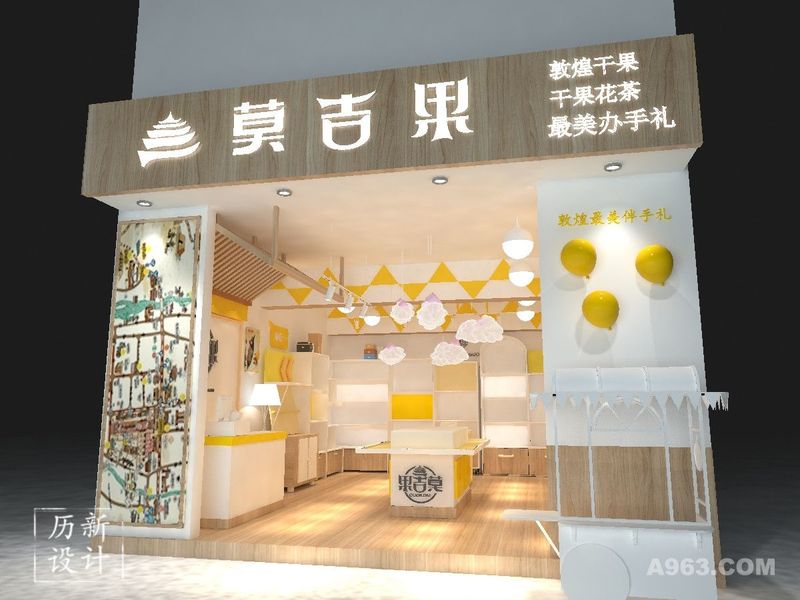
敦煌是丝绸之路的节点城市,是国家历史文化名城,又叫“沙州、沙都”,我们可记起敦煌石窟,敦煌壁画,是历史留下的赠品,我们可以联想到金灿灿的一片黄沙土地,明黄如金子,一展无遗,也浩瀚无边,就像是历史的沉淀。
因而我们给莫吉果的颜色优选明黄,如同黄沙般活力,也给游客留下深刻印象,对应黄沙与石窟壁画,让人记住敦煌,带走敦煌。
Design Notes:
The decoration design of the gift and jewelry store mainly has the choice of wall decoration materials and colors, and the use of the wall.
In fact, in the decoration design of gift and jewelry store, the most important thing in the layout of the store is to use the wall.
Dunhuang is a node city of the Silk Road. It is a famous historical and cultural city of the country. It is also called “Shazhou and Shadu”. We can remember the Dunhuang Grottoes and Dunhuang murals. It is a gift left by history. We can think of a golden yellow. The sand land, the bright yellow as gold, is unfolded and boundless, just like the precipitation of history.
Therefore, we give Moji fruit a bright yellow color, which is as vibrant as yellow sand. It also impresses visitors. Corresponding to the yellow sand and grotto murals, people remember Dunhuang and take Dunhuang.

整个店面浏览效果 The entire storefront browsing effect

未改造前照片 Unreconstructed photos

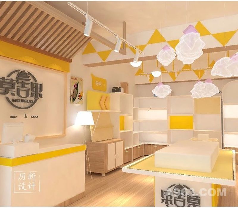
在白色和干净的背景下,我们选择了空间色彩组合的设计方法,添加了充分的美感,促使产品脱颖而出。 收银台的颜色要照应店面墙壁以及门头的颜色。 In the white and clean background, we chose the design method of the spatial color combination, adding a full sense of beauty, and making the product stand out. The color of the checkout counter should be in accordance with the color of the store wall and the door.