- 首页
- International
- 艾特奖
- 文化节
- 服务体系
-
网站导航
项目名称:广州Poppy内衣店设计
Project Name: Design of Poppy underwear store in Guangzhou
主设计师:彭建
Chief designer:Peng Jian
参与设计师:周城林 陈冠
Participating designer:Zhou Chenglin Chen Guan
设计说明:
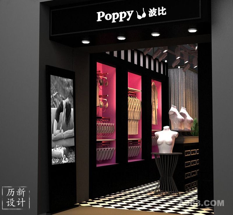
Poppy内衣品牌自身定位别具一格,不同于市面上大众化的内衣,它是具有一定的神秘感,同时也具有一定诱惑感。因此我们主要用色是黑色和紫色,神秘与诱惑相撞,外表冷漠,内心浪漫。
不是初春少女的羞涩和满怀浪漫,而是经过了岁月打磨,有了一定社会阅历而折射出来的,吸引人的女性内心深处的魅惑和知性。
Design notes:
The Poppy underwear brand has its own unique positioning. It is different from the popular underwear in the market. It has a certain mystery and a certain temptation. Therefore, our main color is black and purple, mysterious and temptation collide, appearance is indifferent, inner romance.
It is not the shame and full of romance of the young girl in the early spring, but the charm and intellectuality that is deeply rooted in the hearts of attractive women after years of polishing and having a certain social experience.

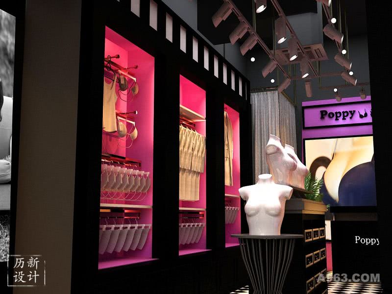
总体来看内衣店构造,我们可以看到天花板是不做保留的,目的是使其挑空不感到压抑。店里品牌LOGO在紫色背景下尤为显目,神秘与高贵,灯具是聚焦灯,这样可以将主要灯光打在衣橱上,也更容易聚集客户的目光。 From the overall view of the underwear store structure, we can see that the ceiling is not reserved, the purpose is to make it empty and not feel depressed. The store brand LOGO is particularly conspicuous under the purple background, mysterious and noble, the lamps are the focus lights, so that the main lights can be placed on the closet, and it is easier to gather the customer's attention.

店铺设计了一些灯箱海报展示,这样可以很好的展示每一个季度主题趋势。 The store has designed some lightbox posters to showcase every quarterly theme trend.

我们保留了原有的地板,只是在上面铺贴了很薄的一层黑白间隔的PVC胶地板。黑白格子简约时尚,可以很好地融入整体构造,衣橱整齐,给予人整洁大方的舒适感。 We kept the original floor, but laid a thin layer of black and white PVC flooring on it. The black and white plaid is simple and stylish, and it fits well into the overall structure. The wardrobe is neat and tidy, giving people a clean and comfortable feeling.