- 首页
- International
- 艾特奖
- 文化节
- 服务体系
-
网站导航
项目名称:广州聚德方私房菜餐厅
Project Name:Design of in Ju Defang private home cuisine restaurant in Guangzhou
主设计师:彭建
Chief designer:Peng Jian
参与设计师:周城林 陈冠
Participating designer:Zhou Chenglin Chen Guan
历新设计网站:http://www.fulgorbrand.com/
The website : http://www.fulgorbrand.com/
设计说明:
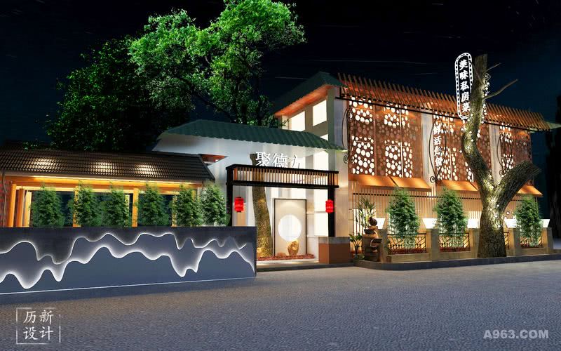
考虑到这个项目是旧厂房进行改造的,所以我们在建筑结构上并没有很大改动,而是在原有的结构上设计,进一步美化外观。由于这是一个顺德私房菜,并且空间相对是很足的,所以我们优先考虑中式与小资风格的相结合,保留中华的装饰以及西方一些元素的结合,这样既不失原有的韵味,也能带点潮流的感觉,更好地提供一个用餐的环境。
我们用咖啡色来给冲孔镀锌板上色,最后用来装饰建筑的外观,装修里边用到了塑料瓦片和一些绿色植物,即使是低成本,也能营造一个很到位的气氛。
Design note :
Considering that this project was transformed by the old factory building, we did not make much changes in the building structure, but designed it on the original structure to further enhance the appearance. Since this is the private home cuisine in Shunde, and the space is relatively full, we give priority to the combination of Chinese style and petty bourgeois style, retaining the decoration of Chinese and some elements of the West, so as not to lose the original charm, but also A little bit of a trend, better to provide a dining environment.
We use brown color to give the color of the punched galvanized sheet. Finally, it is used to decorate the appearance of the building. Plastic tiles and some green plants are used in the decoration. Even at low cost, it can create a very good atmosphere.

正面看餐厅的总体效果图。我们可以看到外观是比较中式的,入口处悬挂着两个灯笼,左边板块引入“高山流水”的说法,添了几分文人雅致以及品味。入口处右边造景,与左边相对应。整个餐厅都添了一些绿色植物,使得整体多了几分生机勃勃的气息。 Look at the overall rendering of the restaurant on the front. We can see that the appearance is more Chinese, with two lanterns hanging from the entrance, and the left panel introduces the expression of “lofty mountains and flowing water”, adding a bit of elegance and taste. The lands on the right side of the entrance correspond to the left side. The whole restaurant has added some green plants, which makes the whole part more lively.


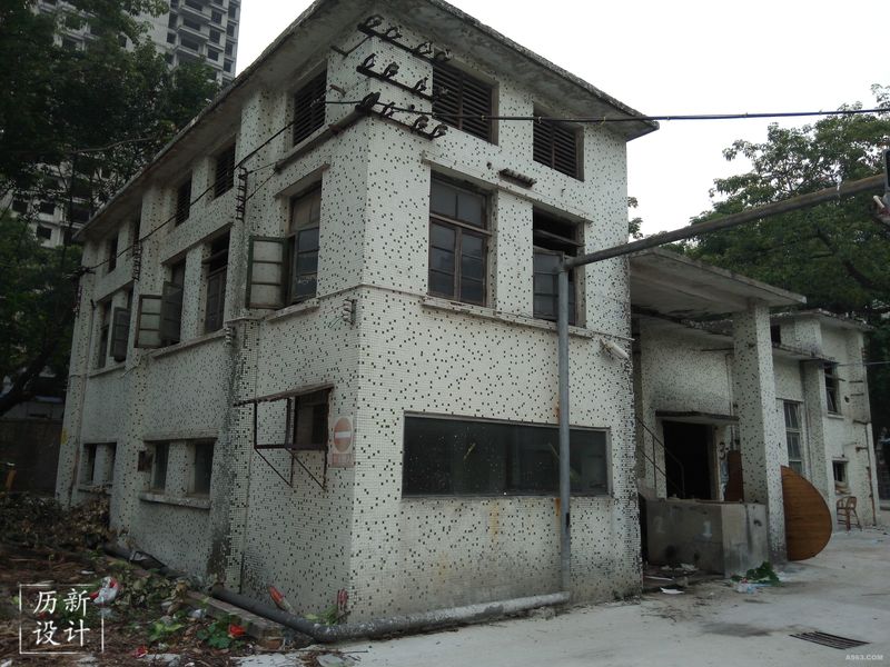
这是没改造前的形象,可以看出这栋楼是很高,面积很大的。 This is the image before the renovation. It can be seen that the building is very high and the area is very large.