- 首页
- International
- 艾特奖
- 文化节
- 服务体系
-
网站导航
参与设计师:周城林 , 陈冠
Participating designer:Zhou Chenglin ,Chen Guan
设计说明:
越来越多的人喜欢佩戴银饰,许多创业者就此抓住机会,想开一家银饰店,那么怎么样的银饰店会吸引更多人流量呢?除了地方的选择,银饰质量的保障,最主要的是一个店面的装修,如果能一下子抓住人们的眼球,就是极好的。
我们给Outi Linka的定位就是奢华,但是也不失时尚和低调,选择冲击力强大的色调,别具一格的装修,这些可以使人们产生一览到底的购买欲,可以得到更多消费者的青睐。
Design Notes:
More and more people like to wear silverware. Many entrepreneurs seize the opportunity to open a silverware store. So what kind of silverware store will attract more people? In addition to the choice of place, the guarantee of the quality of silverware, the most important thing is the decoration of a storefront. If you can catch people's eyes at once, it is excellent.
Our positioning for this store is luxury, but it is also fashionable and low-key, choose the strong color of the impact, and unique decoration, which can make people have a desire to buy at a glance, and can be favored by more consumers.
我们可以一起来赏析一下这个案例:
We can come together to appreciate this case:

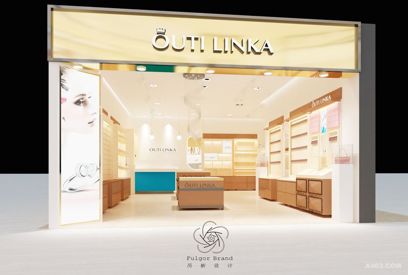
图为店面的总体效果图。根据定位我们定下来的颜色是金属明黄色,活力的颜色可以很好的吸引眼球。银饰店的logo以黄色为背景,居中而立,左边是一则珠宝海报,可以很好地点亮主题。 The picture shows the overall rendering of the storefront. According to the positioning, the color we set is bright yellow, and the vibrant color can attract the eye. The logo of the silverware store is set against the background of yellow. The left side is a jewellery poster that can light the theme well.

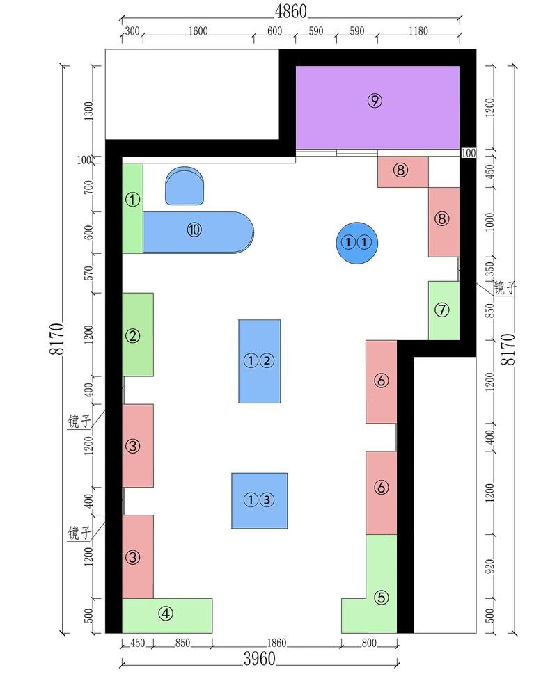
图为平面布置图 The picture shows the floor plan ①装饰柜 Decorative cabinet ②手镯手链 Bracelet ③耳饰 Earring ④橱窗 Shop window ⑤网红展示柜 Display cabinet of Internet celebrity ⑥项链 necklace ⑦毛衣链 Sweater chain ⑧发夹、发箍、发圈 Hairpin, headband, hair band ⑨仓库 Warehouse ⑩收银台 Checkout counter ①①展柜 Showcase ①② 胸针 Brooch ①③戒指 Ring finger

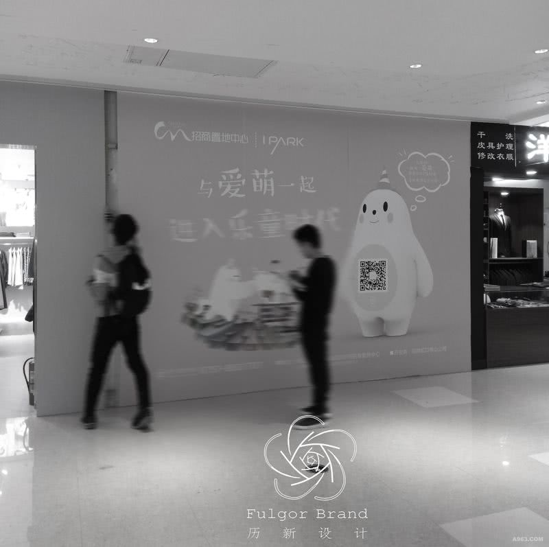
这是在勘测未改造前的现场图 This is a picture of the scene before the survey was remodeled.