- 首页
- International
- 艾特奖
- 文化节
- 服务体系
-
网站导航
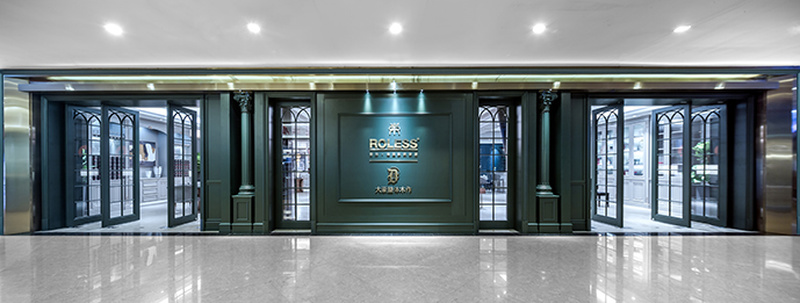
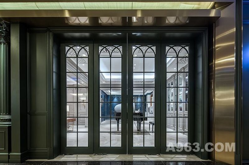
李忠光先生受邀为德国系统家居ROLESS做设计,10月ROLESS效果落地正式开始营业。
cozy house
In July 2018, Mr. Li Zhongguang was invited to design German System Household ROLESS. In September, ROLESS was officially launched.
这是一个有“温度”的设计。本案总体色调较深,这时候灯光很容易就成了主角儿,而这静谧色彩中的光亮很容易让人联想到一个词——“温度”于是乎以【温度】来命名本案在合适不过了。
This is a case with "warm and light".The lights in darkish color are easily becoming the highlights, and the light is easily associated with a word "cozy" which is the most proper name for this case.
【温度】既有欧式风格的仪式感和庄重,又有法式风情的浪漫格调。本案公共区域的用色都非常的大胆多样,意在给客户展现更多的可能性。
[cozy house] , is not only majestic and ritual resemble classical-European-style, but also be full fill of French romance.The color of the public area is very bold and diverse, and it aims to show more possibilities to the customers.
客餐厅区域使用了大量的灰色,这种灰仿佛有着与生俱来的魔力,它柔和而舒缓、宁静而内敛,搭配上灯饰和绿植能就轻松营造出时尚感与生活质感。
It is used lots of grey in living room and dinning room, which seems to have inherent magic to make people feel comfortable and soothing, peace and restrained. The designer decorates these areas with lights and green plants, which can easily make the house be fashionable and substantial.
设计师大胆地在书房区域运用了少部分的爱马仕橙、以新的形态冲击视觉认知。这种高饱和度的颜色,更加能够将人们的注意力拉倒一个点上来,增加一个家庭环境的层次感。
It is used a little Hermes oranges in the study room,which impacts visual perception in a new form. This high saturated color can make people focus on a point and add spatial Layering to the house.
本案设计理念
现在很多人觉得所谓的“美”是越大越美,越奢越美,越多越美,事实上那是感官上的刺激,是商业语言,不是设计。 所以我们不能把感官的刺激当作美,把所谓“时尚”当作设计。而作为设计师,是有责任去提醒你的客户未来的生活是什么样子的。
Now many people think that the so-called "beauty" is the bigger, the more luxurious and the more multiple. But in fact, it is more sensory stimulation or “a commercial language” than design. Therefore, we can not regard sensory stimulation as beauty, and so-called "fashion" as design. As a designer, it is the duty to remind your client what life will be in the future.
开放式厨房区域
本案在开放式厨房区域采用了大量的低饱和度蓝,这种蓝也被称做是“钴蓝”在色彩中加入一定比例的灰,能增加颜色质感,呈现非常纯粹的感官效果,优雅舒适的格调呼之欲出。整体的色调被压低,低饱和度的配色平衡了视觉,再搭配上一个金属质感的装饰物让空间看起来有一种高级感。
Open kitchen
The case in the open kitchen area used a large number of low saturation blue, this blue is also known as "cobalt blue" in the color added to a certain proportion of gray, can increase the color texture, presents a very pure sensory effect, elegant and comfortable style of call out. The overall tone is depressed, the low saturation color matching balances the vision, and then matches with a metallic decoration to make the space look a high-level sense.


